Remix this Generation
Prompt
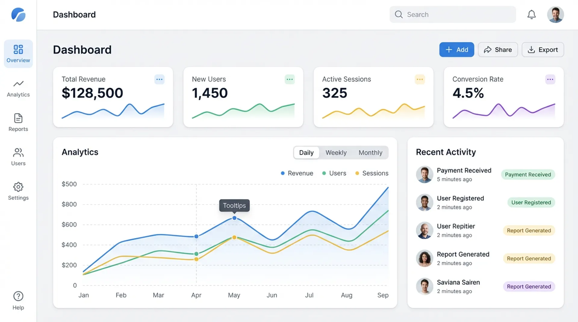
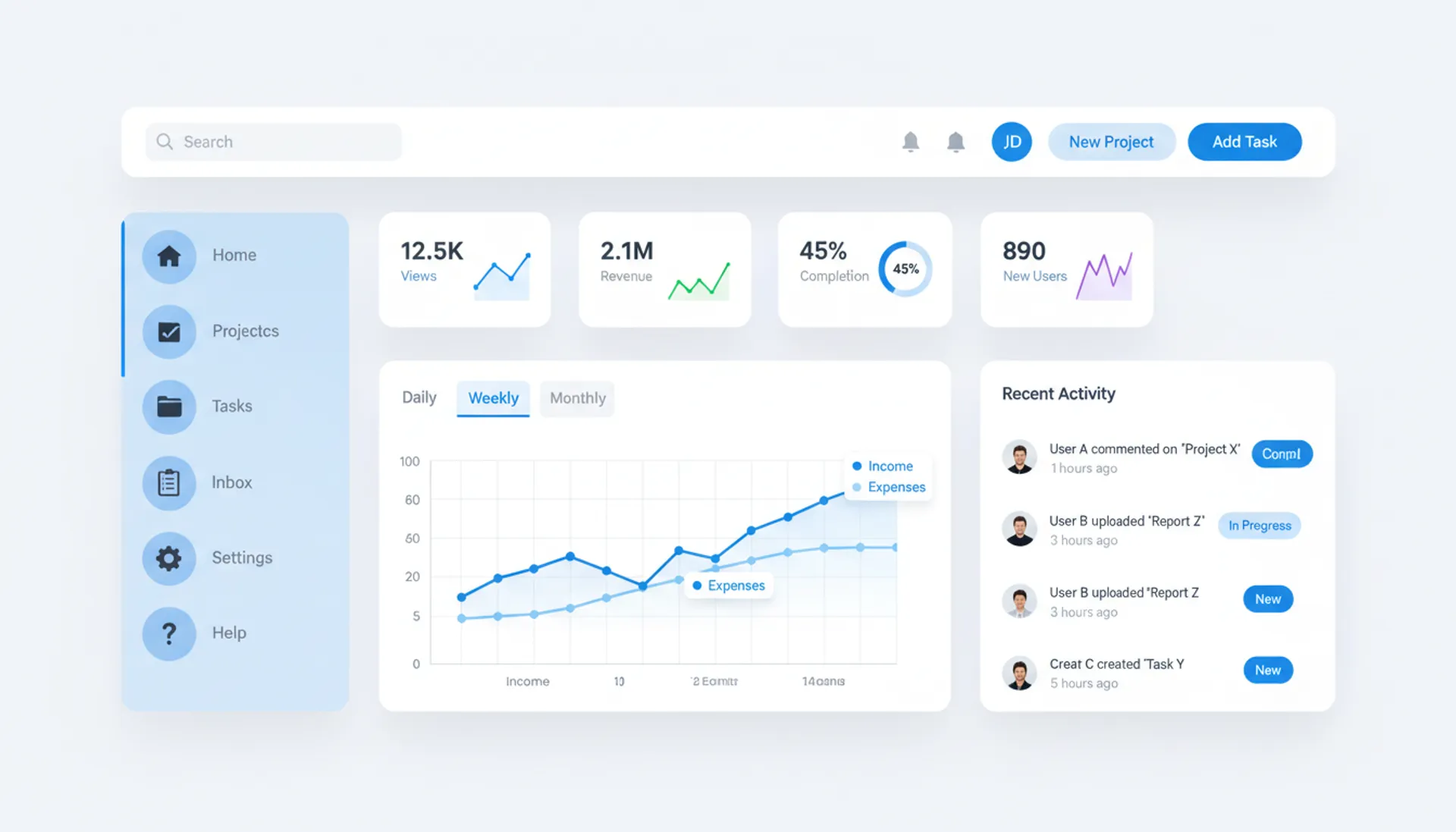
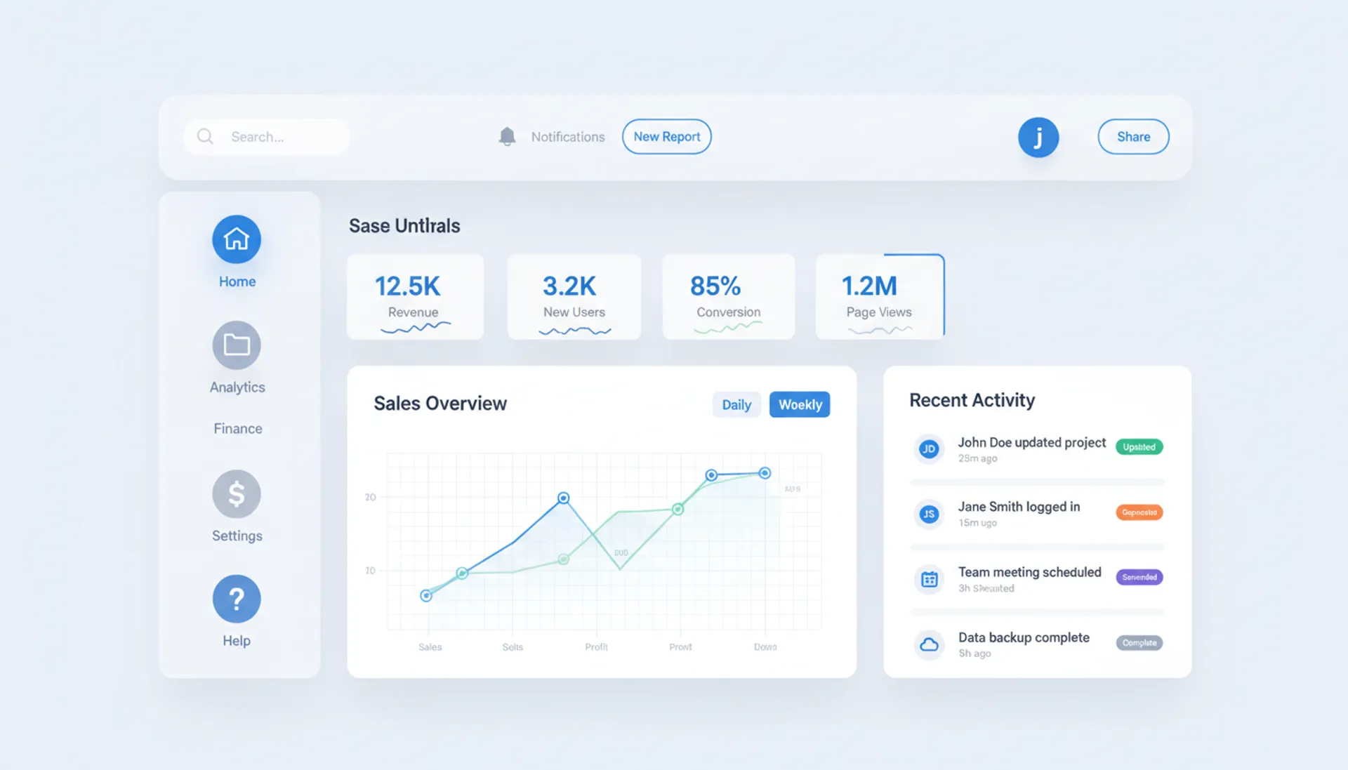
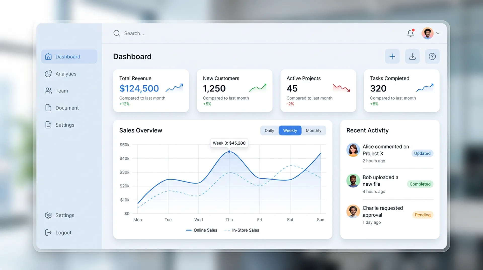
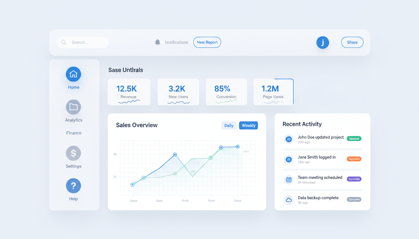
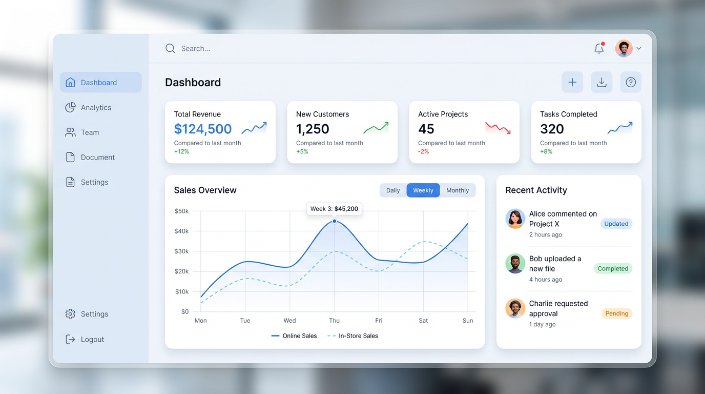
“Design a modern, clean, and professional dashboard UI with a minimal aesthetic. The layout features a left-aligned vertical navigation sidebar with rounded icons and concise labels. At the top, include a slim header bar with a search field, notification icon, user avatar, and quick-action buttons. The main content area uses a 12-column grid system and displays multiple responsive cards with soft shadows, subtle gradients, and smooth spacing. The hero section shows key KPIs in small stat cards—each with bold numbers, concise labels, and small line or sparkline charts. Below the KPIs, add a large analytics chart card with tabs for switching between ‘Daily’, ‘Weekly’, and ‘Monthly’ views. Include a clean line chart with gridlines, tooltips, and color-coded data sets. Also include a recent activity list with timestamps, user avatars, and status tags. The design emphasizes readability, with ample white space, rounded corners, consistent iconography, and a calm color palette (shades of blue, gray, and white). Typography is modern and geometric, using medium weight for titles and light weight for metadata. Overall, the dashboard should look elegant, intuitive, and optimized for both desktop and tablet displays.”
Cost:
$0.600
4 outputs·1 models
Nov 20, 2025